Tuesday, March 29, 2011

(1) Must use three out of four of layouts illustrated below. (2) Use guides and proper angles. (3) CMYK 11in x 17 in at 150 pixels per inch (4) Use Kuler to limit color choices and create a color identity for poster (5) Imagery for posters can be abstract, photographic, musical notes, flowers, clouds, musical instruments, a drawing, etc.. Be creative.

POSTER #1 Use the piano images to make the Piano poster.

POSTER #2 Use construction paper or card board to make visuals for either the Drum or Wind poster.

POSTER #3 Use your own image or creativity to make the image for either the Drum or Wind poster.

45 Single Direction

Vertical/Horizontal
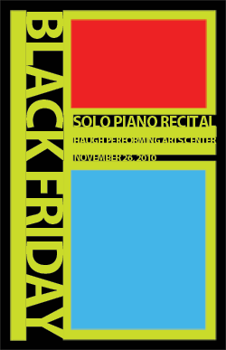
Horizontal
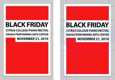
30/60

Create 3 different posters with different design ideas.
choose one version illustrated above and layout info listed below.
COLOR SPACE: CMYK
Size: 11in x 17in
Resolution: 150px/in.

KEEP IN MIND WHAT WILL BE EVALUATED
• Use of the rule of thirds
• Use of rulers and measuring the space
• Use of the guides
• Use of a hierarchy with text (different scale/size of text depending on info represented)
• Limit color choices to give poster an identity (Recommended use Kuler to choose colors)


Info to be included in three posters.
1.

Spring Piano Concert

Showtime:Location: Sophia B. Clarke TheaterAdmission: $12, Seniors, Students & Children under 12 $9, Mt. SAC Students with ID $6

2.

Spring Wind Ensemble Concert

Showtime:Location: Sophia B. Clarke TheaterAdmission: $12, Seniors, Students & Children under 12 $9, Mt. SAC Students with ID $6

3.

Sunday, March 20, 2011

ASSIGNMENT 2
Create a gift bag inspired by Tiffany stained glass using shape layers.

1 Create a template 17 x 11 inches at resolution 300 px/inch . Follow demo, key to template use grid and make sure snap to grid is turned on.
2 Research what early Tiffany stained glass looks like.
3 Make design be sure to use the grid to organize the design. Key work is design (Example being sure you are aware of where shapes are placed on the grid the exact angles shapes are rotated.

Tuesday, March 15, 2011

CLASS 6
Demo making an orange look otherworldly. Much of this demo based on this tutorial Product Shot.

Wednesday, March 9, 2011

NEW TOOLS
B (Brush)
[ (Brush Smaller)
] (Enlarge Brush)
E (Eraser Tool)

Tuesday, March 8, 2011

COLLAGE AD
Create an add for a pizza restaurant choose one of the following names and collage together an idea for a promotional poster or card for a window in the restaurant.

8inches x 8inches
150 pixels/square inch

Dead Gulch Pizza (Western Theme)
West Coast Pizza (Techno Theme)
Red Roaster Pizza (Poultry Mascot)

SKILLS
Selections
Masking
Fills
Layers
Adjustment Layers

Monday, March 7, 2011

Command + ' (turn grid on and off)
Shift (Constrain Proportions and add to selection)
Command + - or + (Zoom in and Out)
Tab (Turn on and off tool bar and palletes)
F (Cycles through various views)
Command + R (Turns off and on Rulers)
Command + X (Edit>Cut)
Command + A (Select All)
Command + D (Deselect)
Command + Z (Undo)
Command + T (Transform)
[ ] (Change the size of the brush)
Q (Toggles Quick Mask)
X (Toggles Between Foreground and Backround Colors)

Feather Softens the edges of a selection

Tuesday, March 1, 2011

ASSIGNMENT
You will create a series of collages using Photoshop. These collages will be connected to the lectures and what we are learning in class about how to use Photoshop to edit pictures. Think of these collages as covers for music cd's or images for posters. You should be creating about one collage a day. The first part of class will involve a lecture about the software and then you should use what you learned in the collage.

DAY 1 COLLAGE
Connect two objects together so they make visual sense from the assets given to you in class. How to use selections will be most important skill learned to discard the back round and cut apart the objects. You will add color for instance a highlight by using a layer styles.

GROUP PRESENTATIONS
In groups of 2 or 3 choose a designer from the website History of Design or Design is History and you will also be given a design principal. With that principal you will describe how that designer used that term in a work he or she made.

Answer 3 questions
1. Describe the design principal.
2. Show an example of how design principal connects to a work done by chosen designer.
3. Describe why the designer is significant.

Design Principals to be assigned to each group

Balance, Color, Unity, Proximity, Repetition, Emphasis, Contrast, Continuity, Size, Shape, Line, Texture, Space